Tuesday, October 30, 2012

Established Material

On this Tuesday, the design team @ Nacho Average Challenge have a color challenge for you to try.  The thing that I love about color challenges, is that you can use any stamp set, or layout, to create your master piece.  And, well, the color challenge this week, just happens to use one of my all time favorite color combinations.  Here is this week's color challenge, #18:


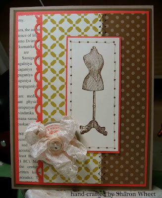
I love how soft suede and calypso coral look together.  And well, throw in some summer starfruit, and you have a great pop of color!  Here is what I created:


I started with a card base made from crumb cake card stock.  I then added a layer of soft suede and calypso coral.  I stacked a piece of first edition dsp, neutrals dsp, and comfort cafe dsp.
I stamped the dress form in soft suede onto very vanilla card stock.  I stamped the sewing label in calypso coral classic ink onto very vanilla card stock, and then matted that circle onto crumb cake card stock.  I rubbed some very vanilla craft ink onto a weeded button and used my heat gun to set the ink.  I made a multi-loop bow with very vanilla seam binding, that I crinkled myself.  
I did some faux stitching at various places on this card.  I did a criss cross stitch on two dsp papers.  And a straight stitch around the main panel.  
I hope that we have inspired you, and find some time to create and play along with us @ Nacho Average Challenge.  

Saturday, October 27, 2012

Hallowe'en Sweets

I have been busy getting some crafts done for this years holiday arts and craft fairs, that I am attending.  I hope this year is just as successful as last years! and I hope the fair goers love my creations.  Don't worry, I'll post some photos soon!  
Anyways, the super creative Marcy, over @ Our Creative Corner has a super fun challenge for us this week.  She would like us to embrace the spirit and theme of Hallowe'en, and use the masking technique.  Ok, now how fun is that?
I think Marcy is a super talented lady, and I hope that our design team has inspired you to play along with us this week.  Here is a photo of my 'Masking' technique project:


I purchased a case (yes, a case) of these plain, blank, kraft food-safe bags about 3 years ago.  And yes, I still have some left {smile}.  Anyways, I am making home-made short bread cookies for the folks at work.  And well, I needed something fabulous to package them in!  So, I grabbed 8 of these window bags, and set out to embellish/decorate the bags.  
For my MASKING technique, I needed to mask the 'window', so that the polka dots wouldn't be stamped on the 'window' material.  I wanted the bag to look 'clean' and not 'rushed'.  (I'm not sure if that makes any sense to anyone but me.)
So, I masked the window to stamp the polka dots.  It's a large background stamp from Stampin' Up! and I love the distressed polka dots.  Very vintage.  I also used a lace wheel by Stampin' Up! and I love the feminine shabby look of that.
For my tag, that was the easy part.  I purchased this holiday paper from a local scrapbook store and cut out the hallowe'en 'cards' and matted them on black card stock.  I took some black seam binding, and crinkled it up.  Made a multi-loop bow and used a green polka dot brad to hold it together.  I punched a scallop circle out of champagne glimmer paper.  I also made this cute, tiny tag, which I couldn't get a good photo of.  It sits under the brad, and simply says, 'sweet'.  I put these elements together, and viola! you have a decorative tag.
For the clothes pin, I brushed mod-podge on the pin, and dunked it in some champagne glass glitter.  To set the glitter, I sprayed the clothes pin with Aqua Net.
Thank you so much for stopping by.  And I hope you get a chance to play along with us @ Our Creative Corner.  We would love to see your masking technique!

Friday, October 26, 2012

Mix & Match

It's Friday! and the talented ladies over @ Sketch Frenzy Friday hope to inspire you, to play along with us.  Tammy F., is the designer of this weeks sketch.


my card this week, is a bit different than my 'usual'


I used different pattern papers, and two different stamp sets.  I wanted to pair pattern papers that coordinate.  I just love the look of a sentiment that has different fonts.  I encourage you, to play along with us this week.  Use your imagination, use your creativity, and create something beautiful.

Thursday, October 25, 2012

Baby Sunshine

This week has started like gang busters!  I have my first craft fair Friday, November 9th, and so I have been busier than before crafting.  Crafting, in all manners: paper, fabric, altered objects, and gift packages.  But, I did need to take a break, and create something beautiful for my newest granddaughter.  I purchased some yellow pattern paper from My Mind's Eye: Lost & Found collection, several months ago.  I saw the paper and thought it looked beautiful.  I didn't have a project in mind, I just fell in love with the paper.  Then last month, a girl friend gave me a package of brad embellishments that coordinated with this pattern paper. 
When I took a break from my Christmas crafting, I picked up this beautiful yellow pattern paper, and created a frame insert for my daughter.  This pattern paper collection is yellow, cream, black, and yellow glitter!  Just gorgeous!  I wasn't sure as to which photos my daughter would use, so I provided her with 3 matts for her favorite wallet-size photos.  
Here is this 'scrapbook page' layout:


Here are a few close-ups:

I created the scallop circle with a new die from Stampin' Up!.  I used my 2" circle die to cut the circle matt.  I used this fun section of the Sunshine pattern paper: yellow trike and 5 cent stamp.  The sentiment piece I adhered to this circle says, "remember THESE MOMENTS always".  I thought on a baby page, this sentiment would speak volumes.  I used yellow half-pearl brads to hold this sentiment to the scallop circle.
This trio-banner piece was actually fun to put together.  The first banner has a number "3" on it.  This child will be my daughter's third child.  The middle banner says, "cutie pie", because lets face it.  She is!   And the last banner is blank.  The color is a dark charcoal grey.  I used light grey half-pearl brads.  I thought these 'gems' added some softness.  I stamped a fancy "L" onto a lined-pattern paper and used a 1" circle punch to cut it out.

Thank you for stopping by and taking a 'look-see', as to what I have been up to lately.  Don't forget, take time out of your busy, stressful day, to create something.  Anything.  Baking, sewing, pottery, paper crafts, gardening, etc.  This activity will help decrease your stress, give you joy, and exercise the other side of your brain.  Have a wonderful week!

Tuesday, October 23, 2012

Birthday Banner

Welcome to my blog.  On this Tuesday, the Nacho Average Challenge site has a sketch for you to try. The sketch is pretty straight forward.  But, I like to 'see' the sketch in a new light.  To help inspire you, and hopefully you will play along with us.  So, without further ado, here is this weeks sketch:


There are a lot of different objects you could use with this sketch: snowflakes, leaves, ornaments, but what about a banner?


What a fun card!  I used Comfort Cafe DSP for the pattern paper.  I used the pennant punch to create the pennants.  I used the modern label punch for the narrow flags.  I used two circle punches for the middle piece (1 1/4" and 1 3/8").  I stamped 'wish big' in basic black classic ink, from the Pennant Parade stamp set.  Each of the pennants for the banner are raised off the card face with dimensional foam tape. 
For my sentiment, I used the Blooming with Kindness stamp set.  I stamped this sentiment in basic black classic ink, as well.  I just love the font.  It looks so elegant, and I love how the lines of the letters are slim, not bold or thick.  The card base is crumb cake card stock.  I sponged the edges of the card with soft suede classic ink to help give the edges some definition.  
I hope you find some inspiration from the design team @ Nacho Average Challenge, and play along with us.  We would love to see what you create with our sketch!

Saturday, October 20, 2012

retro Kitchen

Thank you for stopping by my blog, to see what I've been creating.  I know that I have been a bit late on a few posts and I apologize.  I know that I am in the same boat as a lot of other folks, with life being too busy.  I think I have a new 'schedule' to get more accomplished.  So, let's see if my new time management schedule does actually work.  I'll keep my fingers crossed.
It's Saturday, and that means that its time for another challenge over @ Our Creative Corner.  Meihsia, is our hostess again this week.  If you haven't seen her work, she does shabby chic/vintage very well.  She has a great eye for soft and delicate!  Just wonderfully inspiring creations.  Anyways, she would like us to make a Clean and Simple card featuring something you would find in a kitchen.  Ok, here is my problem, I have a very hard time creating clean and simple.  I don't know if it is all the white space, or the fact that I can't load the card with embellishments.
Here is what I created:


When I sat down to create this card, I knew that I wanted to use pattern paper that looks like something from a kitchen; wall paper, table cloth (Domestic Goddess DSP).  You get the idea.  I also knew the stamp set I was going to use: Compliments to the Chef .  So, I sat down at my craft table and got to work.  I stamped the flatware in VersaMark, and used silver embossing powder to heat emboss that image.  I just love the detail in the flatware.  So, I made sure to use fine embossing powder.  There is nothing worse than a blob of embossing powder to ruin your image. I had a very had time restraining myself from adding layers and embellishments.  I really wanted to add a button somewhere.  But, I restrained myself and created a CAS card for Meihsia's challenge {smile}.
When I finished, I just had to create another card.  Same products, just not CAS.  Here is that card:


I hope that you play along with us @ Our Creative Corner.  We would love to see what you make, and I'm sure you'd love to share your work with the rest of us in blogland!
Thank you for looking, and have a wonderful weekend!

Friday, October 19, 2012

Soft Christmas

Howdy!  So glad that you stopped by.  This has been a   l o n g  week, and I have to say, that the weekend is a very welcome sight.  But, before I get off on my whining tangent, I'd like to share a card I made!
Fridays, are the day, that we share this weeks challenge @ Sketch Frenzy Friday.  Each week, we, the design team members, take turns creating sketches for everyone to try.  This week, happens to be the week that I designed the sketch.  I have to admit, that I love sharing this side of my creativity.
Here is this weeks challenge:


Here is what I created:


For this card base, I used pool party card stock.  I just love the textured look, so I ran a pool party panel inside the vintage wall paper embossing folder.  I swiped my white craft ink pad along the edges, to give the card a distressed look.  I thought crumb cake might look too dirty, and not vintage.  I cut a decorative panel using very vanilla card stock.  I stamped the christmas ornament three times in certainly celery and rocked the stamp in pool party.  I used the ornament punch, to get that beautiful shape.  I folded each ornament in half and adhered them together.  So, it looks 3-D.  I crinkled the seam binding and tied it in a bow. 
For my decorative piece, I used the snowflake punch and first edition DSP.  I punched a 1" circle from the silver glimmer paper.  I stamped the Merry Christmas in crumb cake classic ink.  I layered the three pieces together.
Thank you for looking.  I appreciate you taking the time to stop by.  I hope that you have a chance to play along with us @ Sketch Frenzy Friday.  I know that we would love to see what you create!

Wednesday, October 17, 2012

Rotary Phone

This is a rare post.  I wanted to participate in a challenge, were I'm not on the design team.  I just wanted to create.  Have you ever had that urge?  I wanted to sit in my craft room, create something in my style, not for a deadline, not for a craft fair.  Just for me.  
I'm a big fan of the Shabby Tea Room #132, and I wanted to play along with them this week.  The requirements this week, are to use the colors in their inspirational photo, and include something rustic and something elegant.  This sounds a bit like shabby chic! and this is right up my alley {smile}.  
I also used a sketch from Crafting Life's Pieces #52.  I wanted to participate in their month long challenge.  So, I combined the two challenges and created a wonderful card.
Here are the challenges:


and here is what I created:


I used some 'vintage' styled pattern papers for this card.  I actually used pattern papers that I received as an attendant gift @ the Inspired Retreat, sponsored by the Hen House Paperie, last month; Market Street by Lost & Found. I just loved the floral-text papers, and I'm a super fan of all text papers.  I sponged some of the pattern papers with a kraft ink.  But, I wanted a different distressed look on the center green floral pattern paper.  So, I brushed picket fence distress paint along the edges, and then dunked the pattern paper in a tub of dazzling diamond glitter.
One of the requirements, was to include something rustic.  My rustic; the painted wooden button, the cream twine, and the cardboard butterfly.  Another requirement, was to include something elegant.  My elegant; the rhinestone brad at the center of the butterfly, the trio of half pearls, and the glittered distressed edged pattern paper.  I think that I did include the colors in the inspirational photo; brown, pink, silver, green, and white/cream.
That clever telephone stamp is from Unity Stamps.  I stamped the 'call me' stamp in a soft suede classic ink onto a piece of vanilla card stock.  I then matted it on a scrap piece of pink pirouette card stock.  I wanted the focal point of this card to pop, so I used foam tape behind this telephone piece.
I use a lot of seam binding on my paper crafts.  I just love the crinkled look, and the variety of colors, you can purchase.  This beautifully crinkled ribbon is from Prairie Bird Boutique, an Etsy shop.
Thank you for taking the time, to stop by and have a look.  Leave me a comment, and let me know what you think of this card.   Happy crafting!

Tuesday, October 16, 2012

Sahara Floral

Here at the beginning of the week, I wanted to share a card I made for another challenge over @ Nacho Average Challenge.  This week, it's a color challenge.  The colors for this weeks challenge were a bit of a struggle.  Here they are:


Here is what I created:


I just the large floral image from elements of style, and stamped it in sahara sand classic ink.  I stamped the 'tag' in garden green.  The card base is bravo burgundy.  I matted the main panel onto a piece of garden green.  
This isn't my typical card, but I'm kinda embracing the clean and simple look.  
I invite you to play along with us @ NAC.  I encourage you to stop by the rest of the members on the design team, to get some inspiration {smile}

Saturday, October 13, 2012

Circle of Autumn

Happy Saturday.  I have been creating various paper crafting items for my upcoming craft fairs.  I'll be posting photos later this month.  So, I have been focused on Christmas for over a week now.  You know, Christmas trees, Santa Claus, Peace and Joy.  And  so for todays challenge, I really had to change gears.  I needed to transition from red and green, to the colors of Autumn.  The super talented Meihsia, is our hostess this week over @ Our Creative Corner.  She has titled her challenge as, Fall in the Circle.  Meihsia, wants you to create a circle card/project, with fall theme colors or objects.  Sounds very clever, and I know that the creative wheels are already turning in your head.
Here is what I created:


The card base is pumpkin pie card stock.  I just love the shade of orange.  The first circle is tempting turquoise card stock.   I love the way these two non-Authentique card stock colors match this pattern paper.  I used the same pattern paper for the floral image and polka dots.  One is the front and the other is the back.  How sweet and economical.  I used a scrap piece of early espresso quilted ribbon.  I love the texture.  I tied on a button from Lost & Found.  The sentiment piece is actually a die cut from the same Authentique line.  I stamped the 'Hope' in early espresso classic ink.  The ruler piece is also a die cut piece.  This card was relatively quick to put together.  And I believe that it looks quite 'home-y'.
Thank you for looking.  And, I invite you to play along with us @ OCC.  We have a few new restrictions;  you need to turn off 'word verification' and you are limited to entering your card/project to 3 other challenges.  We would love to see what you create!

Friday, October 12, 2012

Antique Pretty

If there was a way to get an extra hour or two out of a day, I'd be all over that! This week  Ok, every week, seems to rush by.  Maybe, if I sleep less.  Well, I'm not sure if I can really function on under 5hrs of sleep.  So, lets cut something out.  Uhm.  I'm still thinking.  But while I'm re-calulating the time in my day, have a look at what the talented ladies over @ Sketch Frenzy Friday have in-store for you this week!   Patrice, has given us a wonderfully workable sketch to work with!  LOVE IT!


This sketch is so easy to work with, you just have to play along with us!  You can rotate or flip the sketch, if you would like more horizontal space.  And don't let the rectangles limit you.  Here is what I created:


I replaced the long vertical rectangle with a banner piece.  I replaced the horizontal rectangle with a circle.  And then, I just jazzed it up!
I used pink pirouette card stock for the card base.  The main panel is very vanilla card stock that I ran through the lacy brocade embossing folder.  I matted this main panel with a piece of soft suede card stock.  The banner is cut from a scrap piece of fan fair DSP.  I wrapped a scrap piece of crochet trim around the top.  I took a wooden button and rubbed it onto a very vanilla craft ink pad.  Then I dunked the wet button into a tub of dazzling diamond glitter.  I used a heat gun to speed up the drying time.  I used a length of linen thread to tie the button to the crochet trim, and then into a bow.  
For the circle, I stamped the sentiment from the blooming with kindness stamp set, in soft suede classic ink.  I used the 1 3/4" circle punch, to punch out the stamped circle.  I added a piece of first edition DSP to the stamped circle, and hand trimmed it.  I used a sanding block to help smooth out the rough edges.  I used a small piece of champagne glitter paper and the delicate doilies die to create the beautifully scalloped circle.  I used dimensionals to pop the sentiment off the glitter paper.  I added three tiny half pearls under the sentiment, to continue the vintage look.
I edged all papers with crumb cake classic ink and a sponge.  I wanted the card to have a vintage feel. 
Now, won't you play along with us @ Sketch Frenzy Friday?  We would love to see what you create!

Tuesday, October 9, 2012

Blue Skies

Happy Tuesday, folks!  It's hard to believe this week is off to such a roaring start.  But, to help kick off my creativity, I wanted to share with you the card I made for the latest challenge over @ Nacho Average Challenge.  I have to say, the ladies there, are very talented, and I am sure that you will find some inspiration!
This week, it is a sketch challenge.  I have to secretly admit, that I really do prefer sketch challenges.  Here is this week's challenge:


Here is what I created:


Here are hyperlinks to the rest of the design team:

When I first saw this sketch, I thought the repeating four squares could be anything!  At first I thought about flowers, then I thought about four 'windows' to showcase any repeating object.  And then, I thought about butterflies.  I don't know why I just love winged things so much.  But I do!  
The card base is not quite navy card stock, then a matt of baja breeze card stock.  The pattern paper is from comfort cafe DSP.  I matted it on a scrap piece of soft suede card stock.  I used four squares of first edition DSP.  To create my butterflies, I first collage stamped three different stamps, then used the beautiful wings emboslit.  To create the flower, I punched out four scallop circles and scrunched them.  For my sentiment piece, I stamped the 'label' and then tore it out.  I added a multi-loop bow made from some baja breeze seam binding.  I added a tiny tag for my sentiment.  
Thank you for looking.  Now, I hope you have been inspired to play along with us @ NAC.

Saturday, October 6, 2012

Yellow Crown

Holy Moly, this weekend is running away from me.  As you know, on Saturdays, the super talented ladies over @Our Creative Corner have a new and fabulous challenge for you to try.  Liliana, has a new challenge for us.  She would like for you to use yellow and a crown on your paper craft item.  Sounds fun! and pretty clever, if you ask me.  She has also given us a photo for inspiration.  What a gal!


I have to admit, the very first thing I thought of was a Queen Bee.  I know, I'm so predictable.  But, I soon realized that I don't have a bumble bee stamp.  So, here is what I made, instead:


I used scraps, again, to create this card.  The card base is crumb cake card stock.  The yellow polka dot is from Authentique.  I had a piece of texture Wisteria Wonder, left over.  I thought the purple and yellow looked lovely together.  The purple/blue floral piece is from a pattern paper that is easily 4/+ yrs old.  The yellow tag, is from Authentique.  I used some yellow seam binding from Stampin' Up! to create the crinkled bow.  I painted a wooden button white and tied it onto my bow with some cream twine.  I edged all the pieces is either tea stain or white.  I stamped a pocket watch in the lower right corner of the floral piece.
Thank you for looking.  I hope that you get a chance to play along with us @ OCC.  Now, don't forget, we have changed a few rules on our challenges:  no more than three other challenge combos, and please turn off word verification.  Have a great weekend!

Friday, October 5, 2012

SFF

Welcome.  It's Friday.  I generally post on this day, and participate in the Sketch Frenzy Friday blog hop.  But this week is different.  The wonderfully talented ladies over @ SFF have a different format.  We aren't doing 'blog hops'.  But rather posting on the SFF homepage.  So, you can see all of our creations without hopping all over blog-land.  How easy is that?  The other way this week is different, is that I was horrible at managing my time.  And I don't work well under pressure.  I didn't schedule enough time to get my card done, and I like to 'play' to reach a creative flow.  And so, the urgency to make something beautiful, was just too overwhelming.  I apologize.  But, enough crying.  Let's take a look at this wonderfully unique sketch.  


This sketch embraces the concept of 'less is more'.  And if you are a super fan of 'white space' you can certainly find some comfort playing along with us.   But, this sketch also allows you to express your creativity.  So, if you love pattern paper, and lots of embellishments, this sketch will work for you, too.  So, grab your paper crafting supplies, and play along with us @ SFF!

Tuesday, October 2, 2012

NAC #14

Wow, I can't believe that it is already Tuesday.  I know that sounds crazy.  But, I spent this past weekend at a stamp retreat.  It started Friday @ 3p and we finished everything up at 1p on Sunday.  To say that I had a fabulous time, is a total understatement.  I truly enjoyed myself.  It gave me a chance to craft uninterrupted for the whole weekend.  No, 'when's dinner?', or 'can you take the dog out?', and even, 'did you wash my hockey stuff?'.  It was truly delightful!!!
But, now it is time to share another creation for Nacho Average Challenge.  These talented ladies will inspire you with Stampin' Up! current products.  Please join us with this weeks challenge.  It's a color challenge.  Here is the color board.


Here is what I created:


I am a super big fan of pink and brown.  Don't know if its the contrast or the creamy dreamy colors together.  Either way, it's a favorite.  I wanted to use two of my all time favorite stamp sets:  Artistic Etchings & You Are Loved.  I also love the technique of masking.  I think it really helps give your craft some depth and a lot of visual interest.  That is exactly what I did, to keep the flowers from being on top of the Eiffel Tower.  I used my markers to color the floral images.  I also used little bits of So Saffron to help accent my card; the tag matt, and the tiny postage stamp.  I thought the postage stamp really added balance to the 'AMOUR' tag.  I used Pretty in Pink re-inker to 'color' my very vanilla seam binding.  I also crinkled it.  I just LOVE the look of worn, tattered look of the seam binding.  I think it gives my paper crafts a 'vintage' look.  
Please play along with us @ Nacho Average Challenge.  We hope we have inspired you!